

For the latest on ecommerce tips and best practices.
Your Product Pages Won’t Convert Without These 4 Elements

The customer journey through an ecommerce website is like a gradual, delicate act of tipping the scales toward a purchase. All the positive factors have to align and no red flags can appear. It’s up to you to create online shopping conditions where the potential customer has no more unanswered questions, no reservations, and feels confident enough to go through with the order.
As you know, of course, plenty of details go into crafting this positive experience for a shopper. As an ecommerce merchant, you’ve got to pay attention to everything from the colors of your logo to the tone of your copy. One area where many of these factors are concentrated is the product page. A product page is the intersection of so many different elements, and can easily tip the scales in either direction: toward a purchase, or back into a forever-abandoned cart. Let’s take a look at four key components any optimized product page should have in order to increase the likelihood of them promoting a sale.
The 4 Components of Any Successful Product Page
#1. Discoverability
This one comes first for a reason. A shopper has no chance of becoming a customer if they’re never exposed to your products. While ads, social media, and branding all play a role in the discoverability of your products, the SEO of your product pages should not be overlooked either. Using the right keywords in your product descriptions can be the difference between a shopper coming across your site in their search for a specific product, and them coming across your competitor’s. Your product-page descriptions should include terms that are:- Searched. Use SEO tools to find out how people are phrasing common searches related to your products, and include some of these keywords in your product descriptions. Add a few synonyms too if they’ll help customers find the product they’re looking for. In the description for denim jacket below, for example, you can see that the merchant used “ripped,” “distressed,” and “frayed hem” all to describe this one style of jacket, because these are commonly used terms that a shopper might use in their search for an item like this.
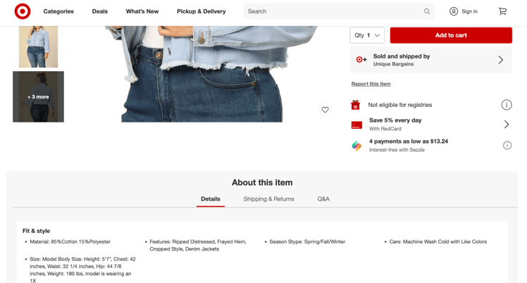
The product description for this denim jacket uses a few synonyms of a descriptive keyword to help shoppers find the item they're looking for. - Descriptive. Describe everything you think a shopper might want or need to know about this product before buying it. What’s it made out of? What are its measurements? What do your customers commonly use it for? Is it waterproof, washable, hypoallergenic, etc.? A product description that leaves shoppers with unanswered questions is not a product description that closes sales.
- Written for humans. A product page that’s too obviously stuffed with keywords ends up sounding like it was written by a robot. It’s likely to be a turnoff to customers, because it makes you seem untrustworthy. Include a variety of keywords to make it easier for shoppers to find the right item, but make sure your descriptions still sound like they were written by and for humans.
#2. Ease
If you had an important guest visiting your home, you wouldn’t keep them waiting on the doorstep for minutes and minutes before you opened the door, or make them walk through the wet grass to get to the side entrance. You’d be sure to greet them warmly right away and welcome them in through the front door to ensure their comfort and ease as your first priority. The same general approach applies to shoppers who find your site. It’s up to you to make their experience there a pleasant and welcoming one. In terms of ecommerce product page optimization, this sense of ease includes:- Load time. The internet and smartphones have made us all impatient. 40% of consumers won’t wait longer than three seconds of load time before they abandon a site altogether. In other words, you could potentially almost double your sales if you can bring slow-to-load product pages up to speed.
- Mobile optimization. Almost three quarters of ecommerce sales now come from shoppers on mobile devices. If your product pages aren’t optimized to display and function well on mobile devices, you’re putting yourself at a major disadvantage.
- Layout and navigation. Finally, your product pages need to be easy to navigate and sort through. Have products listed in intuitive categories that shoppers can jump between without trouble. Make product details and pricing on each page clear and easy to find. The longer it takes a shopper to find the product information they’re looking for, the lower the chances of them making a purchase.
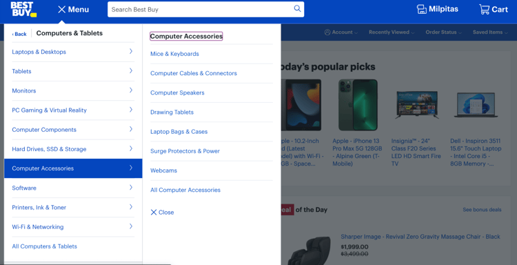
Best Buy sells thousands of different products, which makes an intuitive site and product-page navigation crucial for their shoppers.
#3. Details
Your product pages should be the next best thing to the customer standing in the store and touching the item for themselves. It’s your job to provide every detail that a shopper might want to know. If they can’t find the answer to their make-or-break product question, they may abandon your site altogether. As we discussed above, descriptions are incredibly important details to have on your product pages—but photos are as well.
Product photos are not an area where you want to cut corners. You’ll enjoy a healthy ROI if you invest in professional, high-quality images. They should be crisp, clear, and show the product from every angle. You might also offer 360-degree images or even short videos to give shoppers a better idea of what the product is like. Adding in a few lifestyle shots of the item in use can be helpful too, so shoppers can see how it’s used and envision it in their own lives.
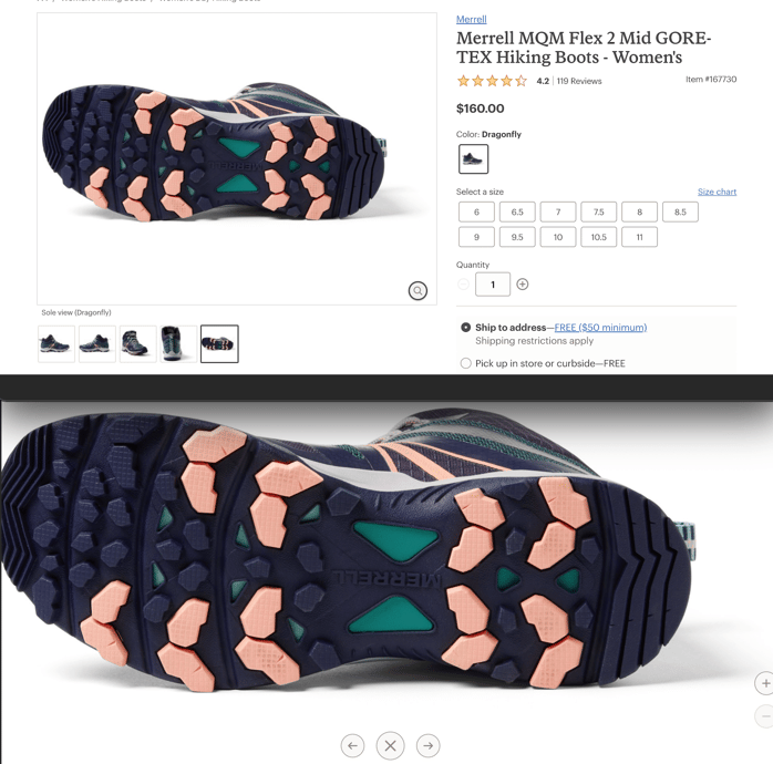
REI's product images of their hiking boots are incredibly clear and detailed. They offer a zoom feature that lets shoppers examine, for example, every groove of the tread on the bottom of any hiking boot they sell.
#4. Trust
New ecommerce stores pop up every day, and not all of them are trustworthy. Shoppers have learned that they need to be cautious when it comes to buying from a retailer they’re not familiar with. Plus, even if they’ve bought from your store before, it’s still up to you to build their trust in the particular item they have their eye on. Here are a few ways to do both:- Showcase several forms of social proof. Showing shoppers that other people have bought and enjoyed your products can tip the scales toward a purchase in the final stages of their decision. You could showcase user-generated content of customers wearing or using your product right on the product page. You could integrate text at the bottom of the page to notify shoppers when someone else purchases the item they’re looking at (“Lisa M. from NY just bought this item!”). Find the form of social proof that resonates with your audience and embed it into your product pages.
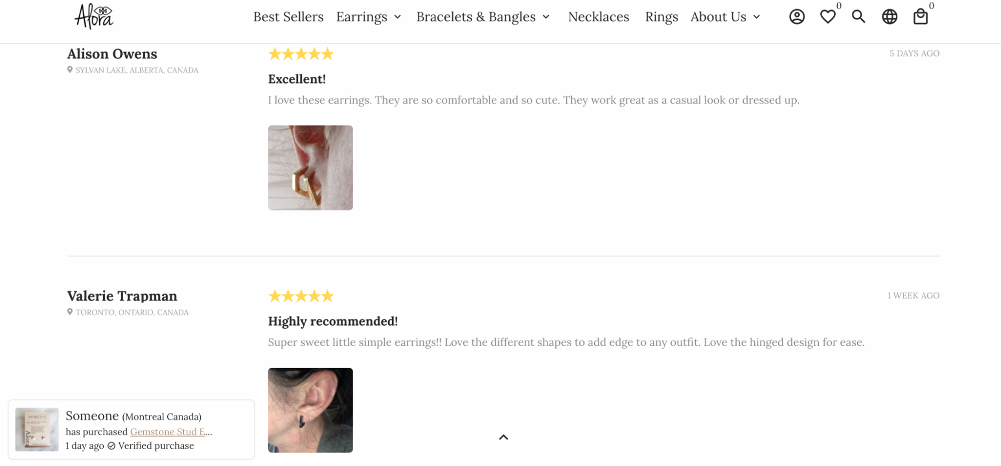
This ecommerce jewelry store allows customers to upload photos with their reviews, and notifies shoppers when someone purchased the item they're currently looking at. - Encourage and respond to reviews across platforms. About 90% of online shoppers read reviews before they make a purchase. Whether it’s a review about your store or a review about the product itself, they want to know about the experiences of others before they commit. So not only should you display product-specific reviews on your product pages, but you should also encourage past customers to leave reviews for your store in general across major platforms (Google, Trustpilot, Yelp, etc.).
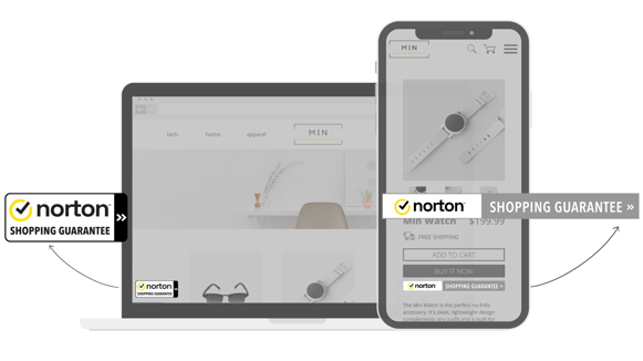
You should respond to these reviews as well, especially if they’re negative. It’s an impactful way to build and manage a positive online reputation as a digital retailer. - Display a well-respected, recognizable trustmark. Another powerful way to tip the scales toward a purchase is to show shoppers that your site is vouched for by a trusted third party. That’s where a quality trustmark like the Norton Shopping Guarantee comes in. Displaying it on your site lets shoppers know that their purchase is protected, eliminating the major risks of buying from a new retailer.
The Norton Shopping Guarantee offers customers $10,000 in identity protection if there’s an information breach, a purchase guarantee up to $1,000 in case they don’t receive the product, and a $100 lowest-price guarantee to reimburse them if the price goes down after their purchase. It’s an easy and powerful way to show shoppers right there on the product page that you can be trusted.
Invest in improving your product pages today
The best practices for e-commerce product pages boil down to these four elements: discoverability, ease, details, and trust. If you can check all of these boxes for each product page, your sales are highly likely to increase. If you’re looking for an easy upgrade to your product pages that you can do today, request a demo of the Norton Shopping Guarantee. We’ll show you how impactful this widely recognized trustmark can be on the success of your business, and getting started is easy. Contact us today!
| Looking to increase shopper confidence? Find out how Norton Shopping Guarantee helps you eliminate buyer hesitation by instantly creating trust for visitors who shop on your site. |
Stay in the know
Subscribe to the Norton Shopping Guarantee blog and receive the latest in ecommerce best practices.


-1.png)
.png)